Beyond Templates: Achieve Pro Graphics in Under 10 Minutes
"Design isn't about innate talent; it's about how intelligently you use a well-built system."
For a small business owner or a corporate professional, the biggest hurdle isn't a lack of creativity—it's the terrifying white screen staring back at you.
If you don't have a design degree but need to produce high-quality visuals, mastering a tool like Canva is your fastest path to looking like a pro.
Key Takeaways * Templates are a starting point, not the finish line: Don't just swap text; maintain brand consistency. * Master layout rules: Proper white space and alignment can instantly elevate your work.
* Integrate AI into your workflow: Use built-in AI tools to eliminate repetitive, time-consuming tasks.
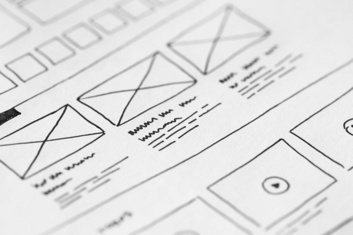
Why does every design project feel so overwhelming?
At midnight in your dim bedroom, your eyes ache as you stare at the blinding white glare of a blank screen.
It is 11:30 PM on a Tuesday, and you are sitting at your desk in a quiet home office, staring at a blank digital canvas. You need to create a promotional graphic for a social media campaign, but the blinking cursor makes you feel like an impostor.
You wonder why, in a role that doesn't involve design, you are expected to produce something that looks polished.
This feeling doesn't stem from a lack of artistic ability. It happens because you lack a systematic process and a clear standard for what makes a design "good." In an era where everyone is expected to be a content creator, most of us don't have the budget to hire a full-time graphic designer.
This makes template-based tools an essential lifeline.
However, a common mistake is treating a template as a finished product. Many people simply swap out the text and hit "save," believing the job is done. While these designs might look clean, they often lack a unique brand identity or a clear hierarchy of information, which makes them look amateurish.
To move beyond basic copying, you must learn to reinterpret templates. How can you turn a generic layout into a professional-grade asset in under ten minutes? Let's look at the specific strategies to bridge that gap.

How can I turn templates into professional assets? Imagine it is 3:00 PM on a Thursday, and you are sitting in a busy local coffee shop with your laptop. You suddenly realize you need to whip up an urgent promotional banner for an upcoming weekend event. Instead of scrolling aimlessly through endless options, you need a strategy.
1. Repetitive tasks requiring brand identity When you need to post daily social media content, you shouldn't be reinventing the wheel every time. You must lock in specific colors and fonts that match your brand guidelines.
Using a "Brand Kit" allows you to maintain a consistent look across all platforms without hunting for hex codes every morning.
2. Information-heavy graphics When your goal is to share data or long-form text, flashy graphics are your enemy. In these cases, readability is the priority. You should feel free to delete decorative elements from a template to make room for clear, legible text.
Using variations in font weight and size helps guide the reader's eye through the information.
3. High-impact promotional banners For sales or urgent announcements, the layout should remain stable, but the emphasis must be sharp. Use a single, bold accent color on your most important keyword to grab attention.
Creating high contrast between the background and the text ensures the message is caught in a single second of scrolling.
The way you handle a template should change entirely based on its purpose. So, what is the actual step-by-step workflow to ensure high quality every time?
Can I have a high-quality design process in 10 minutes? Before you start, pour a fresh cup of coffee and clear your workspace. Design is often a race against time, but speed only works when it is backed by a logical sequence.
- Search for specific, purpose-driven templates
- Instead of typing a generic term like "social media post" into the search bar, try specific combinations like "minimalist business flyer" or "pastel organic event banner." Look for templates that are easy to modify. If a template is overly cluttered with complex graphics, it will be difficult to customize without breaking the layout.
- Apply brand elements (Color and Font)
- Once you select a template, immediately swap the default colors for your brand's primary colors. Many tools allow you to change the entire color palette of a page with a single click. Keep your font choices limited to two types to prevent visual clutter.
- Adjust layout and secure white space
- This is the most critical step. Do not just scatter elements across the screen. Ensure there is plenty of breathing room between text and images. If elements are too close to the edges, the design will feel cramped. Always use alignment tools to ensure everything is perfectly centered or snapped to a grid.
- Swap images and apply professional effects
- Upload high-resolution photos to replace placeholder images. Using built-in frames helps keep images looking neat and uniform. If a background makes text hard to read, place a semi-transparent shape behind the text to create a clear, professional layer.
- Final review and export
- Check for typos and ensure the text is large enough to be read on a mobile phone. Finally, select the correct file format—such as PNG for high quality or MP4 for motion—and export your work.
As you repeat this process, the anxiety of the "blank screen" will be replaced by the strategic joy of choosing the right starting point. However, there are clear limitations to relying solely on templates.
The pros and cons of template-based design
You might feel a sense of accomplishment after finishing a project, but a quiet voice in your head might ask, "Is this actually good?"
Pros: Efficiency and accessibility The primary advantage is speed. You can complete a task in minutes that might take a professional much longer.
Additionally, because templates are built on established design principles, they provide a high-quality baseline even for those without formal training.
Cons: Lack of originality and "cookie-cutter" feel If everyone uses the same popular templates, brand identity disappears. If your designs look exactly like every other business in your industry, you lose credibility.
Relying too heavily on a template can also limit your ability to communicate a unique, creative message.
Comparison Guide
| Feature | Using Templates | Hiring a Professional |
|---|---|---|
| Primary Target | Solopreneurs, small teams, daily tasks | Full branding, large-scale advertising |
| Time Required | Very fast (10–30 minutes) | Slow (days to weeks) |
| Cost | Low (subscription-based) | High (project-based) |
| Flexibility | Moderate (within template constraints) | Very high (limitless) |
| Consistency | Hard for beginners to maintain | Very high |
The key is knowing when to use which method. Use templates for daily operational efficiency, but consider professional help for high-stakes projects that define your brand's identity.
Avoiding common pitfalls and staying within safe boundaries
Late-night work sessions often lead to "feature creep," where you keep adding elements because you want the design to look "better." This is where mistakes happen.
First, respect copyright laws. While elements provided within design platforms are generally safe, be extremely careful when importing outside images or fonts. Always verify that you have the proper commercial license for any asset you use.
Second, remember that less is more. Adding too many effects, too many colors, or too many fonts is the fastest way to ruin a design. The goal of design is not to be "pretty"; it is to communicate a message clearly.
Third, prioritize mobile readability. Most content is consumed on smartphones. A design that looks perfect on a wide desktop monitor might have unreadable text when viewed on a small mobile screen. Always check your work through a mobile lens.
By following these rules, you can move your work from looking like an amateur's attempt to looking like a professional's execution.





Comments 0